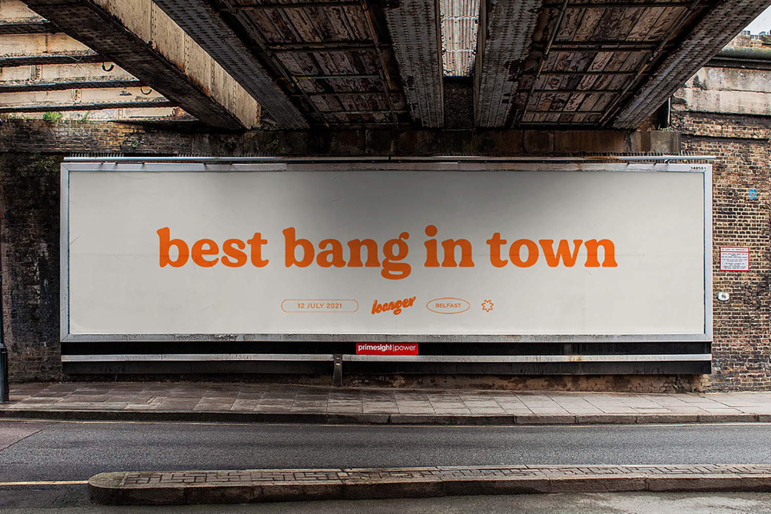
"Plenty came to us for a rebrand with two goals. The first was to convey the uniquely craveable flavor of Plenty produce. The second was to create a warmer and more approachable brand that felt accessible to all. Rather than sticking to typical healthy green visual cues, we took inspiration from desirable food categories which reflects in both the identity and packaging work."
26.1.21
29.12.20
19.12.20
29.11.20
22.11.20
BASILICA HUDSON
"Space and place means everything at Basilica. Centred around its iconic architecture, the design system pays direct homage to their mission."
8.11.20
23.10.20
CUOZZO FLEMING
Cuozzo Fleming by POST.
"The new identity is bold, iconic and bright, firmly rooted in the vibrant hero colour blue. The printed collateral is timeless in its design with a confident application and meticulous execution."
14.10.20
27.7.20
5.7.20
NATIONAL AMBULANCE MENTAL HEALTH GROUP
National Ambulance Mental Health Group by Pentagram.
"When used on its own, the monogram references the harmony that’s needed between mind and body, which is the focus of the NAMHG. When repeated, it represents community and becomes a graphic element which can be used to visualise infographics, such as statistics about mental health."
Subscribe to:
Posts (Atom)